Imagine working tirelessly to reach your fundraising goals. You prepared a fundraising plan, promoted your cause everywhere, even reached out to your social media community.
You received words of encouragement from your team and your prospect donors, but still you could reach your fundraising goal.
What could go wrong?
Did you consider design?
People who visit your website make snap judgements.
Did you know? It takes around 50 milliseconds to make a first impression on your website visitors. That means you have literally a fraction of a second to convince a donor to use your donation form. They can be easily put-off by use of certain colors, fonts, text layout or a badly constructed form. You have one shot to get it right – so make it count.
Start with the look and feel of the entire donation page. Too many nonprofit donation pages are suffering from common donation page problems like unresponsiveness, length, general clutter, and even security issues. These 4 tips can help you improve and optimize your donation page.
It’s now time to look at the donation form.
In our experience, certain forms work better than others. You will learn to create the perfect donation form for your cause with some experimentation. In general, the following best practices are a safe option.
When fundraising for your cause, the form linked to your collection page will allow you to retrieve all the information you wish to ask your donors, as a donation is made. You can customize the fields proposed, make them obligatory or not, to make sure that you receive the most important information first.
To get the most out of this step, it’s important to strike the right balance between the essential information to carry out your business, to carry out future communications, and the optional information, which would give you information but could discourage the donor. The longer it takes when form is filled out, the more likely you are to see donors leave the page because they will find the process too time consuming.
Essential information
The essential information is therefore that which relates directly to the certificate of payment of the donor or his tax receipt.
- name
- first name
- birth date
- address
They should be requested by default on all your donation forms.
What additional information to I ask donors?
You can add a specific set of questions, in the form of different types of fields:
- Short answer/ Free field: Donors will be limited to 250-character responses.
- Long answer/ Free text: Donors can answer as free text with no limit on character length
- Date: Donors will have to fill in a date. For example, their date of birth.
- File: Donors will need to download a file. For example, an identity card.
- Yes / No choice: donors will have to answer a yes or no question.
- Drop-down list: allows asking a question and lets the donors mark their choice among a proposed list.
For each of the proposed fields, the “field name” is the name visible to donors at the time of payment.

The placement of the form on the page is equally important.
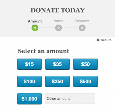
Don’t forget to include it right at the top of your homepage. Providing some quick donation options on the form nudges people to take quick action.
Our tips for an effective form
It may be good to ask your donor for his phone number. Warning: if you make this field mandatory, it can be annoying for people who do not want to communicate their personal number. You can also apply this field to certain pages only. If you plan to invite larger donors to an event, for example, have them give you their phone number, but do not ask smaller donors.
You want to communicate with your donor in the future? Just ask them if they want to receive the newsletter or not. In the same way, you can suggest to the donors to choose what kind of communications they would like to receive a choice in the form of a drop-down list. It could be tax-related, related to their giving summary or payment method, or it could be notifications about the project they donated to.
Lastly, always thank them once the donation is made, and test your form before you go live! These two steps are so crucial for the success of your online fundraising.
Follow these simple steps to make your donor experience a little bit better. Share the post with your network if it helped you today.
donation form donation page Donors fundraising goal online fundraising
Last modified: April 28, 2025


